Projects
Form
& Verify
SaaS Landing Pages
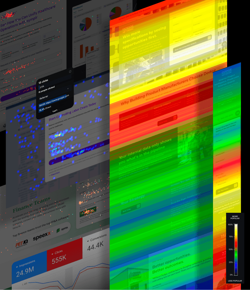
A landing page it is a designed argument, a sequence of decisions about what a visitor sees first, what earns their attention next, and what finally asks something of them. Over the past two years, I have built close to one hundred of them for SaaS clients across the full funnel, from top-of-funnel awareness to bottom-of-funnel conversion, and each one began the same way: with research. Before any visual decision was made, the objectives were defined: what this page needed to do, for whom, arriving from which channel, and with what prior knowledge. Wireframes followed, mapping information hierarchy before resolving aesthetics. High-fidelity designs came after the structure was sound, not before. Pages were built and published in Unbounce, then tracked: heatmaps, scroll depth, click patterns, session recordings through VWO, Crazy Egg, or Clarity, depending on the client stack. That loop (build, observe, adjust, rebuild) changed how I approach UI design at a foundational level. You learn quickly, when a hundred users a day are showing you exactly where they stop reading, that design decisions have consequences that taste alone cannot predict. The data does not replace judgment; it sharpens it.


More Projects